This post assumes that you know at least the basics of Webflow, so if you don’t really know much, don’t worry, one of the many upsides of this tool is that it has a strong community behind it and also lots of free resources to learn from. You can start with the basics in their learning center and then continue here.
I’m a senior product designer at FullStack Labs with strong skills in HTML, CSS, and some Javascript, the industry sometimes calls this a full-stack designer (it matches our company name!). If you have a similar background, you’ll see that Webflow is a pretty awesome tool. If you are a designer without those skills, I suggest you first learn the basics of HTML and CSS. Critical topics are the box model, semantics and CSS modularity, and naming conventions (I use the BEM model). Javascript is not necessary, but very useful further down the line. If you have a clear grasp of these concepts, you’ll build better and faster websites! Now, let’s see if Webflow is a good fit for you.
Evaluating Your Current Site
Although Webflow is a great tool for building and maintaining websites, you first need to evaluate if it’s a good fit for your project.
Webflow is good for:
- Portfolios
- Company sites
- Landing pages
- Marketing sites
- News, blogs, or similar sites that rely on lots of content updates
- Basic e-commerce sites
Webflow is not ideal for:
- Heavy data-driven sites. This means sites that need to call large chunks of data. Some examples are Airbnb or Booking.
- Sites that rely on real-time data. Think tracking services, Twitter, Kayak, or weather sites.
- Complex e-commerce sites. By complex, I mean something massive with thousands of products, filters, and customer accounts.
- Anything that needs a user login or an admin dashboard.
- If you find yourself spending a lot of time adding and modifying custom code, guess what? You should better be spending your time building the site on some other tech more suitable for your needs.
Now that you have a clear idea of what Webflow is best suited for, let’s move on to the first steps in migrating a site over.
First Steps
First of all, congrats! Moving a site to Webflow will make updating and modifying the site way easier and faster. So if this is one of your goals, you’ve started with the right foot. The idea is to make your website perform way better and also be easily updatable. But first thing’s first.
- Current Site Style Review: Scan every page of your current site. You’re looking for common elements used throughout the site (for example a card with an image, a title, some text, and a button), font styles (headings, paragraphs, lists...), buttons, and colors. Time for a list! List everything you find. Later you can decide what is really needed and what is not.
- Current Site Code Review: You need to look for complex interactions or components that require coding like sliders, modal windows, graphs… Again ask yourself if this is needed for the current site, in what way could it be better and what’s the current toll (speed wise) on the site.
Now that you have a clear picture of every element and interaction used on your site, we can move into Webflow.
The Style Guide

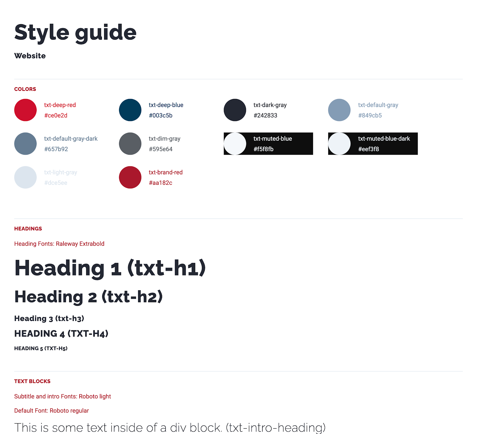
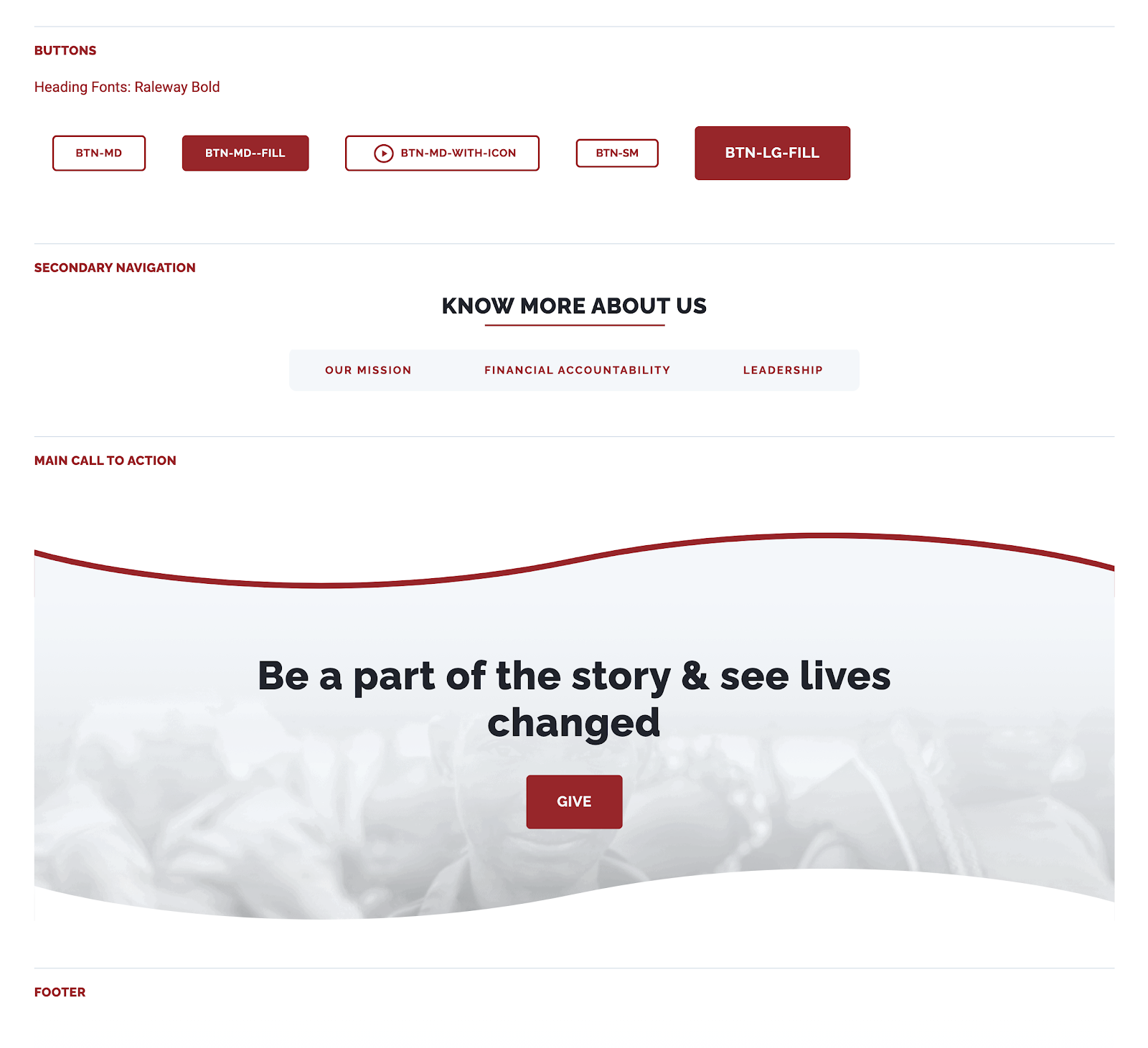
Having a style guide is fundamental. I know this isn’t the most fun part of the project but I’m telling you, you really need this. The more detailed the better, but don’t go overboard with it. Also, it’s not meant to be pretty, it’s meant to be functional. Here’s an example of a Style Guide I made for a client a while back. What about those weird names in parenthesis? Those are the real CSS naming conventions I used in the project!
Interesting things to note on the page are the margins, paddings, and container sections. You’ll just see text, but if you inspect the HTML (in Google Chrome you can use the ‘inspect’ tool for this), you’ll see that each module has its own CSS style applied to it. For example, if an element has a top padding of 48px, and that particular style is used all over the place, then it makes sense to build an element with that padding and give it a name. For example pt-48 (padding-top: 48px)
Essentially, I recreate the styles found on the current site. Extra points if you build them more efficiently. The idea is not to copy everything as is, the idea is to take advantage of Webflow and improve the style guide and element building. Make it as modular as possible, meaning you can just copy and paste elements wherever and they’ll look awesome and work as expected.
Remember your initial site review? Here’s where that process comes really in handy. Once you’ve built all common styles, let’s move on to building common elements.
Common Elements
Every site has elements, like the main navigation, footer, maybe a newsletter subscription form, call to action buttons, that are common on many different pages. Start building all those commonly used elements and convert them to Webflow symbols to easily edit them when needed.

Now that you have all the common elements ready, you’re ready to start building the actual site!
Building the site
Start with the most complex pages and with the base breakpoint (we’ll deal with the other breakpoints later). The ones that you think have more elements involved in the layout construction. Most of the time this means the home page, after all, it’s commonly the gateway page to your whole site.
If you’ve built the elements correctly, you can just go ahead and go to the style guide page, copy the element (cmd + c on Mac works here!) and then paste it (cmd +v on Macs) into the homepage. Rinse and repeat.
If you’ve built symbols, you can also use the shortcut (cmd + e on Macs), a prompt will appear, type sy, and a list of all your symbols will appear. This is one of the reasons for having some kind of naming convention for all your elements. Select the one you currently need. Rinse and repeat.
If you find that you missed common elements or styles, build them in the style guide and come back to your page when done. You can also build them on the actual page and then paste them in the style guide but I tend to forget stuff when I do it this way, but hey, your call!
Elements that you think are rare or only used on one page can be built straight on the page you’re working on. As you build out your project, you may find that some elements you thought were rare are actually common elements. No problem, simply add them to style guide and update the one off elements you created before.
Remember to avoid magic numbers when building your site, try to standardize everything. Paddings, margins, whitespaces. If your current site doesn’t do this at all, then this is a great time to improve it. I’ve been using the 4px baseline grid for a while and it’s pretty versatile.
Responsive Features
Webflow has multiple breakpoints to work with but usually, your current site will have different ones. You’ll need to adapt them to the one’s Webflow uses in order to take advantage of its GUI. This takes a little bit of time to get used to because everyone has a way of building sites and has their ideal breakpoint setup, but once you’ve done a few pages in Webflow you’ll feel right at home.
Start working your way down all to 320px, test and test and test. After you get those, then start working your way up, and don’t forget really big screens, you’ll be amazed how bad a site looks when a page isn’t built for large monitors.
Migrating a content-heavy site?
Maybe your current site is built on WordPress or some other CMS, don’t worry, this is very common and fortunately, Webflow handles this now really well with its CSV import feature. I’m not going to go through all the details involved because that’s out of scope for this post, but a good place to start is by reading this post. Ok, moving on.
Custom Code
So everything is looking amazing in every possible scenario, now you have to deal with the stuff Webflow doesn’t do. Maybe you need a table? For some reason, Webflow doesn’t natively support this. Maybe you need a complex component that calls data from a JSON file or a lazy scroll functionality for your blog posts. All that kind of stuff will have to be done with custom coding.
If you don’t know any code at all, just seek help and talk with your dev friends. Here at FullStack Labs we have an incredible team of talented developers so if I’m stuck or need something really complex, they are always there to help me.
The general rule here is to add code in a `<script/>` tag before the closing body tag, with defer or async attributes. Remember all this code will take a toll on your site’s speed, so if you can do it with Webflow, do it, if not, then this is the way to go.
If the code is going to be used on your whole site, then it makes sense to add it to your ‘custom code’ section on the main settings page. If it’s going to be on a single page, then it makes sense to add it on that specific settings page. Don’t know where that is, here you go!
Final Touches

We are getting there. The site looks awesome, the custom code is working, now we can add some final touches to make it really stand out. Add interactions, maybe a fade-in effect when the page loads, those small details and personal touches are what makes your site, your site. Plus, they also look really cool! But again, don’t go overboard with this. The idea is to improve the whole UX of your site and every interaction you add will also make your site heavier.
Speaking of this, Webflow has some nice tools to make your site faster, SEO friendly, and more accessible, you should always take advantage of those! Plus, they are always adding new features, so everything will get better and better.
Rebuilding existing sites is a great way to learn everything about Webflow, once you feel comfortable with your process, you can tackle a project from scratch and that is always fun. At FSL we have our own way of delivering successful projects so you should always aim to have something that suits you in order to avoid guesswork or time draining problems.

I hope you enjoyed going through this with me and learning along the way, remember to just keep at it and in no time you’ll be a Webflow pro!


